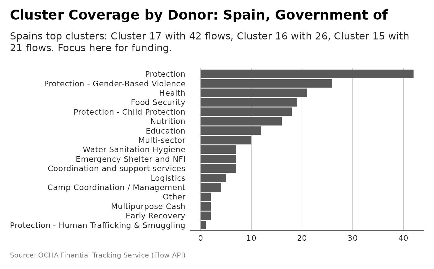
Visualizes which humanitarian clusters each donor supports, using the number of flows per cluster. Useful to understand donor focus and alignment with sector priorities.
Examples
p <- plot_donor_cluster_coverage(flows, donor_name= "Spain, Government of")
# and plot with more powerful subtitle
dubbed <- generate_plot_story(p, provider = "azure", model = "gpt-4.1-mini")
p + ggplot2::labs(subtitle = dubbed)