Plot donor funding on a world map with proportional symbols
Source:R/plot_donor_location_map.R
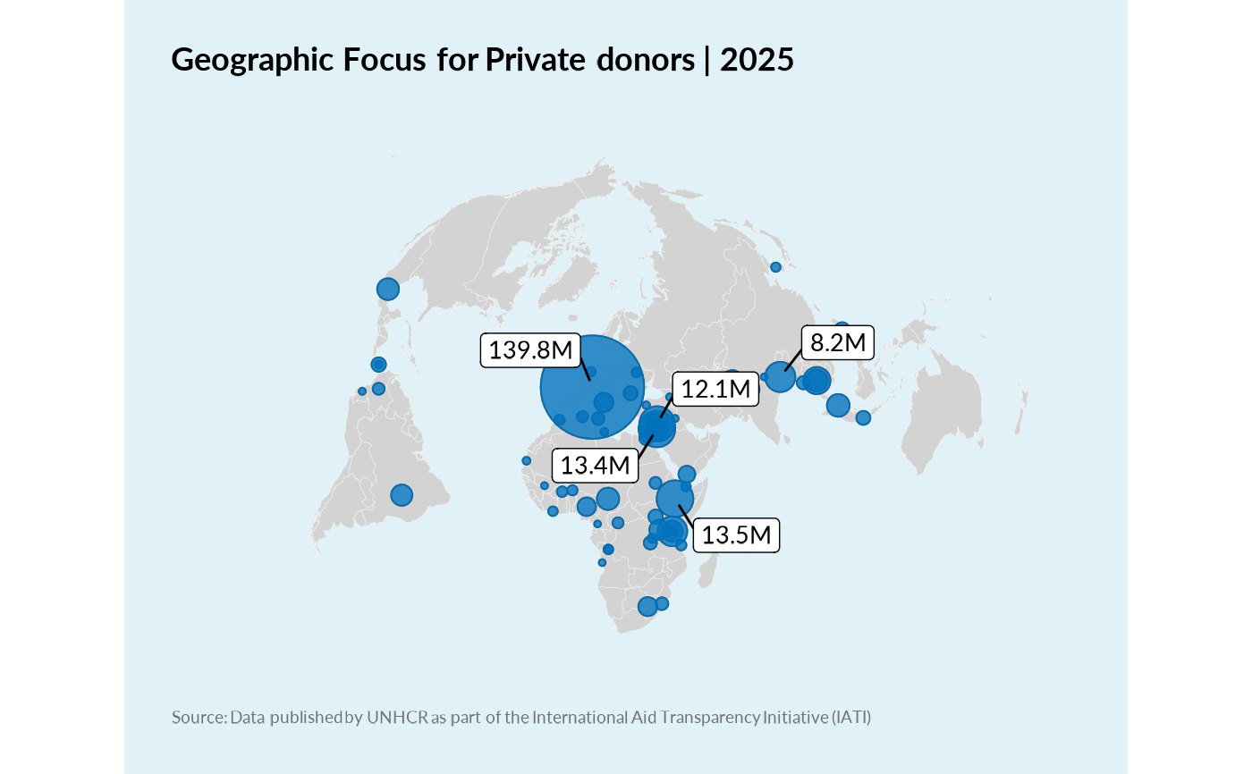
plot_donor_location_map.RdThis function generates a world map showing funding locations for a given donor and year(s). It uses proportional symbols where a white outer circle represents the total funding from all donors at a location, and an inner UNHCR blue circle represents the specific donor's funding at that location. The visual difference between the two circles provides insight into the donor's contribution share. Top locations by donor funding are highlighted with ggrepel labels. The map uses a Bertin 1951-like projection (Equal Earth) for good world generalization.
Arguments
- donor_name
Character. The name of the donor to filter by.
- year
Numeric or integer vector. Year(s) to filter the transaction data.
- top_n_locations
Integer. Number of top locations (by donor funding) to label using `ggrepel`. Defaults to 5.
- max_symbol_size
Numeric. Maximum size for the proportional symbols. Adjust based on data range and desired visual effect. Defaults to 15.